
How To Make A High Conversion Landing Page

How to make a website landing page that has a high conversion rate?
The simple answer is to have a GREAT call to action – and design everything else on the lander to direct your prospect’s attention to it.
What’s a Landing Page or Lander?
It’s a page on your website at which a prospect arrives from a link – maybe an ad, or an article, or a forum signature, anything. A good landing page is an ‘orphan’ – it has no ties or links to other sections of your website, leaving a visitor only 2 choices… leave the page or follow your call to action.

EzineMarketingCenter.com
A landing page may exist for lead generation or to warm up prospects in preparation for an offer. The latter are also called ‘jump pages’ or ‘click through pages’, because they are one step along a multi-step process.
A lander is effective for marketing because your visitor’s concentration is 100% on your call to action.
No distractions. No options. No irrelevancies.
Your call to action might be to get visitors to:
- subscribe to an email list
- download an ebook or report
- support a movement
- sign a petition
- register for something
- access a free gift
- receive a newsletter or podcast or webinar
Whatever your call to action is, your landing page will help deliver it. You shouldn’t launch any campaign without a dedicated lander to display to your audience.
How Your Call To Action Impacts Landing Page Design
Visitors arrive at your lander from a marketing call to action (CTA). When they arrive on your landing page, you’ll be presenting them with another CTA – a lead generation CTA or a warming up CTA.
So your marketing CTA must match the landing page to avoid a “disconnect” at the point of arrival.
Your lander should mirror or extend your marketing call to action.
- Maybe your ad promises an ebook. Your landing page must reinforce the offer – and tell more about the ebook.

Monetate.com
- The link in your article’s resource box may mention in-depth content about the topic. Your lander must include links to that content, and highlight the value you offer.
The better your lander matches your marketing CTA, the higher will be the conversion rate of your landing page.
What Goes On Your Landing Page?
Effective landing pages have certain elements in common. These elements guide and direct your visitor’s attention towards your call to action, persuading and influencing them to take the action you want them to.
Relentlessly, convincingly and skilfully, a well designed lander will guide prospects down the greased chute towards your CTA… and push them over the edge!
So, what are these critical elements of a good lander?
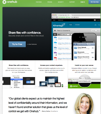
OneHub.com
- 1. Your convincing premise – delivered through a powerful, punchy, promise-laden headline, supported by a more detailed sub-headline, and backed up by copy on the landing page.
- 2. An attention-grabbing photograph or picture or video – which not only captivates and reels in prospects, but is also targeted and relevant to your offer or call to action.
- 3. A bulleted list of benefits – which mention features of your product or service, but also spotlight the advantages your ideal customer or subscriber or donor or supporter will receive.
- 4. Social proof – by way of testimonials and reviews, feedback and comments, from happy users or clients who have earlier followed your call to action.
- 5. Your CTA form or button – which your ready-to-buy/join prospect can fill or click or share to deliver your “most wanted response”.
The pattern and arrangement of these elements is a function of good lander design. In layout and structure, these different elements should tell your website visitor a convincing story.
- A story that they trust and believe.
- A story that resonates within them.
- A story they want to share, be a part of, and benefit from.
Start with the powerful headline that must capture a merely curious visitor, and instantly turn him or her into an eager-to-know-more prospect.
Headline writing is an art and a craft. Study it. Practice it. Master it. This one skill can transform your level of success.
Other elements of the lander reinforce your promise and nudge the prospect closer to your call to action – which tips them over into taking the next step.
- Your photo or video must demonstrate some value your offer provides.
- Your benefits list must speak to your prospects’ biggest pain points.
- Your testimonials should emphasize the value you can provide them.
And then, your call to action must make it a no-brainer to proceed to the next stage.
But It Doesn’t Stop There…
If you’re thinking your call to action (CTA) is effective once you’ve achieved this goal, think again.
You still have work to do. You must reiterate the value you promise AFTER your visitor has acted on your CTA – by validating their decision on the ‘confirmation page’ they reach next.
EzineMarketingCenter.com
- If they signed up for an email list, thank them and explain what to expect from you.
- If they asked for an ebook, give it to them (or tell them how and when you’ll send it over).
- If they asked to be contacted, make an appointment.
- If they purchased a product, deliver it – or give them delivery information.
It’s also another opportunity to subtly market another call to action – to a qualified, trusting prospect!
You can use this chance to build loyalty, strengthen your brand, provide details and information that might have cluttered up your landing page, and deliver greater value than you promised – in a way that’ll convert an eager prospect into a raving fan and a delighted client!
Let’s step back a pace, though, and look at the lander itself – and discuss a few important concepts about your call to action.
Where To Place Your Call To Action On The Landing Page?
Your entire lander is designed to deliver the CTA to your ideal prospects. It is tempting to always put it right at the top, so they’ll see it right away.
But depending upon your offer or purpose, this may or may not be a good idea.
For a simple call to action, such as “Sign up to receive a free ebook”, it can be effective to have your CTA top and center.
On the other hand, with more complex offers that require that you prepare and inform a prospect before asking for the deal, your conversion rate will skyrocket when you place your call to action further down the page.
The key is to present your call to action only to well prepared prospects who are ready to take the next step. Placing the CTA on your lander, therefore, is a matter for trial and testing.
Make Your CTA Stand Out
Good lander design involves making your call to action stand out and be noticed. Here are some ways to make this happen:
- Color – a CTA button that contrasts against the rest of the page gets clicked

FreshBooks.com - Get interactive – make it look like a button
- Bigger is better – and invites the click
Akismet.com
- Draw attention to it with images and graphic elements (like arrows or circles)

ResumeBaking.com - Use dynamic CTA copy. “Submit” is tame and dull. “Give me the report NOW” works better!
- Take away risk. A brief privacy statement can allay anxiety, and boost conversion

Basecamp.com/ - Force action. Use urgency and scarcity in your call to action.

Expedia.com/ - Let your design breathe. Set your CTA button apart with clear space around it

IconDock.com/Design Your Lead Gen Form To Match
The biggest hurdle in getting a first time visitor to follow your call to action is the design and structure of your lead generation form. Ask for too much data and your visitor will bail. Ask for too little, and your marketing suffers.
Forms for data collection must be:
- simple
- easy to understand
- quick to fill, and
- unambiguous in detail
If your questions are confusing or irrelevant, prospects won’t answer them. If you’re too nosy and intrusive, they’ll get uncomfortable.Either way, your conversion rate will suffer.
Keep the information you ask for proportionate to the incentive you offer in exchange. You can give away an ebook or report, coupon or free trial, newsletter or consultation. The higher the value of your freebie, the more details a prospect might be willing to share.
By and large, though, your CTA is more likely to elicit response when there is very little (or no) friction. Think about it while designing your landing page and call to action.
Crafting Your Call To Action – Where Do You Begin?
While every piece of copy on your landing page matters, the two most important elements are:
- your headline, and
- your actual call to action
Your headline is meant to capture visitors’ attention and get them to engage with your lander.The purpose of all other copy is to lead the visitor towards your CTA.And your call to action only has to compel the desired action – without letting your ideal prospect off the hook!
Keep things clear and simple.
Avoid getting cute or fancy.
Great copy gets out of the way, doesn’t draw attention to itself, and achieves its goal of getting a visitor to the CTA button.
The call to action must then kick in and do its job well. There are two questions it must address in your prospect’s mind:
- what should I do next?
- why should I do it?
Your call to action must answer these 2 questions effectively. When you convince your prospect that what you are offering them has value and can help with their problem or appeal to their desire, your conversion rate will be higher.
But…
Understand that a good call to action won’t appear by magic.
Testing Your Call To Action
You’ll test various options before finding a winner. Don’t trust in formulas or shortcuts. Be prepared to run tests, experiment, and measure results.
A/B testing that compares one headline against another, one kind of CTA against another, one design and structure against another, will eventually arrive at a lander with high conversion.
What should you test?
Optimizing your landing page means being strategic with your testing. There are a hundred different things you could test – but they are not all equally important.
Before testing, take a moment to think about the goals and purpose of your landing page and call to action.
- What are you trying to achieve with your landing page?
- What will indicate that this is happening?
- How will you measure it?
For example, your landing page may exist for lead generation to sell your ebook. Your objective, then, is to sign up visitors to an email list and promote your ebook through follow up messages from your email autoresponder.
Measuring the number of new subscribers you are adding to your follow up autoresponder, and how many copies of your ebooks are being sold, will indicate the effectiveness of your landing page and call to actions.After defining your goals and targets clearly, build your landing page and create variations of it to run A/B tests against each other.
Drive traffic to the test pages from your in-house list, social media, or paid PPC ads. Measure the metrics you defined before and evaluate conversion rates of your landing page variations.
Test elements like your main headline, photos, call-to-action, form fields, testimonials and other parts of your landing page copy. Make sure that the results you get are definitive and convincing before making any modifications to your control lander.
Constantly improving your call to action (CTA) can maximize your investment in time and money into your online business – and get your landing page to convert at a very high rate, generating leads and getting a fair number of click throughs.
Keep this in mind.
You’re spending the same amount of money (and time, and effort) if your landing page converts 1% of visitors, 5% of them, 25% or even 65% of your audience into following through on your call to action.
It is YOUR responsibility to maximize your return by making your landing page the very best it can be – and evolving an irresistible call to action!
For more lessons on powerful email marketing and effective list building that will boost your subscriber engagement and skyrocket your business profits, join the EMAILNAIRE program today. Learn more about it here.
JOIN NOW : Next 12-week eClass Begins Soon! CLICK HERE |